
1) Draw Emphasis to a Single Focal Point:
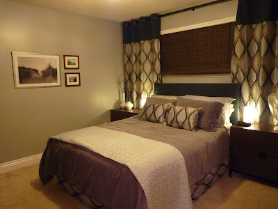
To make the design of your small space more effective, choose a single focal point. In this case, because of it's size, light, and architectural interest, the window in my bedroom was a natural focal point. The wall where I would place the head of my bed is another logical point of emphasis. By placing the bed beneath the window, I combined both of these places of emphasis into a single focal point, thus reducing confusion and competition between the 2, instantly making the room feel bigger.

2) Exercise Your Vertical Space:
Choose Drapes and furniture with long, tall lines. Extending the drapes from wall-to-wall and floor-to-ceiling helped to frame in the areas of emphasis (window and bed), making the focal point of the room more dramatic and dominant. By using the full length and height of the focal wall, the room is elongated and enlarged.
Choose furniture appropriate to your space. I ousted our old conventional dressers, opting instead for tall "his" and "her" wardrobes. This created 2 solutions for 2 problems: clutter, and limited floor space. The height of the wardrobes employs the use of long lines which like the floor-to-ceiling drapes draw the eyes up. Suited to be placed side by side, they take up less floor space than the old dressers, and provide more storage space. The height of the wardrobes also help to reduce the collection of clutter. Before, the tops of our dressers became instant drop-zones for whatever was brought into the room. The height of the wardrobes, make it much more difficult physically to drop things off on top.
 I chose narrow nightstands with long, horizontal lines which helped to elongate the focal wall by filling it end-to-end, and provide plenty of storage space to drop things in, instead of on top of.
3) Remember Less is More:
Do not place anything in the room unless it absolutely needs to be there in order to serve a functional or design purpose. In the case of my bedroom we needed the wardrobes, nightstands, and bed. The room is void of any shelves, tables, chairs, chests, or large decorative items which would only eat up space and make the room feel cluttered. The absence of these items contribute to the feeling of spaciousness, and reduce areas which typically collect junk and clutter.
I chose a more modern, contemporary design for my small space. It's not everyone's cup of tea, but I find that the straight, stream-lined, minimalist features of contemporary design work better in a small space. Again, less is more.
On the large wall, which could be considered the secondary focal point of the room, I chose to place 1 large picture with 2 adjacent smaller pictures, together forming a rectangular collage. While pictures don't eat up floor-space, too many pictures placed even on a large wall can make a space feel cluttered. Choose a few (1-3) large pieces of art to hang on a wall, or several small pieces organized and grouped together to form 1 large shape (giving particular heed to the negative space created in between the smaller pieces to create consistency).
 Don't feel like every space needs to be occupied. Leaving purposely selected areas bare, or empty will contribute to the sense of spaciousness.
4) Organize and Contain the Clutter:
Sort through and organize your stuff. Reduce the amount of stuff accumulated when and wherever possible. Find an appropriate, designated place for needed things. If you can not find a proper place for something discard it, or move it somewhere else.
I designated a specific shelf in each of our wardrobes for small items which typically found themselves in clutter drop-zones (cosmetics, keys, gum, bills, change, receipts, ETC). Containing these types of objects in baskets, boxes, drawers, shelves etc is effective in reducing clutter because eventually the space is filled, which should provoke one to sort through, organize and reduce contained items. When things are left in piles (even organized piles), it is not only unsightly- the spillover potential is limitless, because there's nothing save the room itself to cap off the available space.

I organized my closet with a standard utility shelf for my craft, sewing, knitting, and project stuff (located in the left side of the closet, unseen in this picture), and 4 deep laundry baskets (again think vertical space) to contain the massive amounts of laundry that always seems to accumulate in our bedroom.
 It's effective, it's organized, and most importantly, it's out of sight.
I love the verticle use of space! The His and Hers wardrobes are so great. So great! And the huge laundry baskets are awesome too. I need to do some restructuring.
ReplyDeleteyou have done an awesome job!
ReplyDelete